Web design has something that can be called a “grammar”. When we say design in a nutshell, we not only pursue good looks on the surface, but also improve functionality to make it easier for users to use and reduce the risk of confusion and misoperation. You could call it the upper grammar. Therefore, in this article, I will explain the grammar that you should know when doing web design.
“Basic Grammar” on the Internet
Just as conforming to a grammar makes up an understandable language, so the promises that make things understandable are figuratively called “grammar”. When designing a web page, there are some things to be aware of so that users do not get lost in the page, and these are grammars in web design.
button design
Various buttons are arranged on the web page. There is a way to design such buttons so that they are easy for users to understand and do not cause confusion.
Ergonomic color scheme
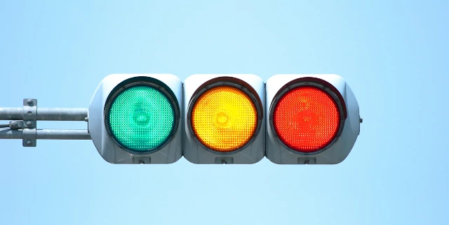
Apart from the color scheme of the entire web page or site, there is a way to design the button colors to have meaning. I have. It is known in ergonomics that there are certain patterns in how colors affect people, and the Japanese Industrial Standards exemplify the use of colors to indicate safety and danger.
Intuitive operability
Button operability is also important. By making the button appear to “dent” when clicked, or to dim the button momentarily when pressed, the user will not be confused as to whether or not the button was pressed.
In addition to visual feedback, auditory and tactile feedback are also good. They take advantage of the property that humans expect some kind of feedback when moving an object.
Read Also: What Is The Color Law Of The Package Design That Sells?
Placement of buttons
Button placement is another consideration. By choosing a “complementary color” for the button color that contrasts with the surrounding color, you can make it stand out, and by adjusting the size so that it does not get buried in the content, you can clearly convey that it can be clicked. Also, a common placement is OK on the left and Cancel on the right. However, when humans see multiple buttons arranged, they do not try to press them until they see all the buttons and see what they mean.
In a typical horizontal left-to-right reading on a web page, you would first see OK, see Cancel, see OK again, and then click OK. So, somewhat counterintuitively, placing Cancel on the left and OK on the right will get users to clicking the OK button faster.
Don’t rely too much on color vision
The concept of web accessibility was proposed as early as the mid-1990s, but now ISO standards have been established based on W3C recommendations, and it is recommended not to rely solely on color vision. In addition to color vision, it is necessary to devise and consider the function of the button in an easy-to-understand manner, such as placing an appropriate icon on the button.
Button text is specific and easy to understand
Some people might get confused that the button on the pop-up “Do you want to undelete the email?” is “Undo” or “Cancel”. To avoid confusing and overburdening the user, the text on the button should be specific about what happens next.
Make the buttons you want to press stand out
It is known that choosing a color that contrasts sharply with the surrounding colors and solidly painting the buttons you want visitors to press on your web page will have the effect of making them stand out. It is also effective to simply make a difference in size or to install it in a place where it is easy to see.
Also, if you have too many options in front of you, you will get lost and you will not be able to do anything, so think carefully about the actions you want users to take and consider limiting the number of buttons to be installed.
link text design
Making link text and non-regular text visible at a glance is a basic grammar I’d like to revisit.
The safest setting is blue underline, which is the default setting for most browsers. However, depending on the site, blue letters may be mismatched. In such cases, we flexibly respond to make it easier to understand by changing the text color but leaving the underline, using a color that does not feel out of place even in blue, or using other actions without using blue or underlining. prize.
Other than color and underline, there are ways to change the text color when the mouse cursor is over the link text, make the underline appear (disappear), change the background color, or some combination of these. .
letter design
Over 90% of web pages are text. And there are many things to think about as a design for characters. Here, I will explain the grammar on the Internet related to characters.
Leading, Kerning, Tracking
If you care about legibility and aesthetics, you need to adjust the type. Three well-known adjustment techniques are leading, kerning, and tracking.
Leading is adjusting the space between lines.
Kerning is adjusting the spacing between individual letters. Since characters have shapes such as straight lines, curves, oblique lines, and corners, the legibility of characters can be improved by narrowing or widening the space between characters to achieve uniformity when viewed by human eyes.
Tracking is the adjustment between character groups. For example, when saying “This is a pen”, adjusting the spacing between letters included in individual words is kerning, but adjusting the spacing between words is tracking.
word count

If a line is too long or too short, it will be difficult to read, and you will lose track of what you are reading and get tired of reading.
There is no clear rule, but it is said that about 35 to 40 characters per line of Japanese text written horizontally is appropriate. Depending on the medium, there is a balance with the overall design.
font ratio
It’s a mistake to change font proportions to adjust the spacing between characters or avoid orphaned lines. Fonts are optimized for readability, including aspect ratio, so proportions should not be changed. If you’re having problems with spacing between characters, kerning will help.
font selection
Fonts are one element of design, but mixing multiple types can make it difficult to read. Try to use no more than 2-3 fonts that match the purpose of creating the content or page.
Also, depending on the user’s viewing environment, even if a font is specified, it may be replaced with the font of the viewing device, resulting in a different atmosphere than the designer intended. In some cases, consider introducing fonts that are less likely to be influenced by the user’s viewing environment.
color design
There is also a theory in color design. Here, I will explain how to design according to the grammar on the Internet.
how to choose colors
Colors are the first thing that catches your eye, so they have a big impact and need to be chosen carefully. Colors evoke certain images to some extent, so choose based on color theory. For example, “blue” is often used in laws and schools to give a sincere impression, “red” is used in restaurants to increase appetite, and “green” is used in hospitals for a refreshing image and “white” for a clean image.
combine colors
Color science says that a color scheme is harmonious when the combination of two or more colors is pleasing to the viewer. The method of such color harmony is summarized in “General Principles of Color Harmony” advocated by an American colorist.
・Principle of order: Regularly selected colors harmonize
・Familiarity principle: Alignment of familiar colors is harmonious
・Principle of similarity (principle of commonality): There is something in the feeling of color Common colors harmonize
・Principle of clarity: clear color schemes with large differences in brightness and hue are easy to harmonize with
If you combine colors using this principle as a clue, you will be able to avoid situations where the color scheme is not in harmony.
Be conscious of readability and clarity
Avoid color schemes that make the text difficult to read or drown in the background, such as low contrast between the background color and the text color. In addition, even for elements that are not color schemes, factors such as inappropriate font sizes, using only uppercase letters in English, and not considering the ratio of kanji and kana in Japanese text are factors that reduce readability.
information design
The purpose of giving consideration to color and character design is to convey information smoothly. Therefore, it is part of the design to arrange the information so that it is easy to convey along the structure.
structure the information
On the side of producing and publishing, there is a desirable way of conveying information, such as how you want people to read it, and how you want them to read it. This is also not up to the user, and there are techniques to visualize and control the structure by arranging information.
Incorporate a visual hierarchy
The simplest is a visual hierarchy that layers the text on the page with different font sizes and colors. This not only organizes the order in which users obtain information but also allows them to lead and present information according to how they want to be read and conveyed.
Avoid orphan lines
A single line at the beginning or end of a paragraph that protrudes onto another page is called an isolated line, which is prohibited in European languages. Even in Japanese, it is not desirable for one character and period to protrude at the beginning of a line.
Isolated lines visually disrupt the structural cohesion of the text. In addition, isolated lines should be avoided as much as possible to prevent readers from misleading and to consider readers with low reading comprehension skills.
Place a prominent CTA
When creating a website with the intention of attracting customers, make sure to place the CTA prominently. A CTA is a message or button that evokes a user action that leads to conversion, such as purchase, restriction, or inquiry.
In order to evoke the reaction you want users to have, it is important to make the position and color of the CTA stand out.
View contact information
The psychology of users who visit a company’s website is thought to be that they want to contact the company. And users who visit the website decide whether to stay or not in a matter of seconds, so if they cannot find information that leads to contact immediately, they will leave.
First, write down your phone number, company address, and email address in an easy-to-find place. Setting up an inquiry form is also effective. However, since the preferred method of inquiry differs depending on the user group, it would be more desirable to approach users by creating a wide range of environments that make it easy to make inquiries within a reasonable range.
Don’t set media autoplay
By placing media such as video and audio on a web page, you can create a moving page. However, we don’t know when the user will open that page. If the page you open suddenly emits a loud volume or starts playing a video, you will be annoyed and annoyed by the communication charges. Even if media is installed, we recommend that you leave the playback up to the user and not set it to autoplay.
