Consideration of “color” is indispensable for design. The image we receive from color varies from person to person, and the image we receive also differs from country to country. Therefore, when designing, it is necessary to consider what kind of impression the target has on the color, taking into account the country of origin.
Therefore, in this article, I will explain the impression that colors give to people, the differences between countries, and the reasons for the differences.
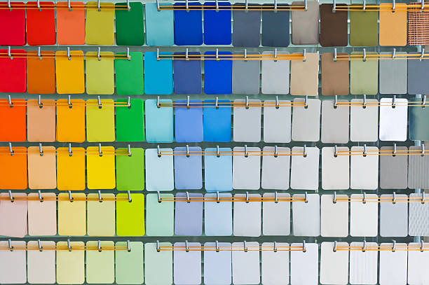
What is the first impression that color gives?
Even if we are not conscious of it, we stimulate our autonomic nerves by looking at various colors. There are two types of autonomic nerves: the “sympathetic nerve” that works during activity and the “parasympathetic nerve” that works during rest.
When the function of the autonomic nervous system is disturbed, it also affects the physical condition. Therefore, it seems that changing the color of what you see on a daily basis may improve your mental and physical health. Below, we will introduce the effects of each color on the autonomic nervous system.
warm color
Warm colors such as red, yellow, and orange are said to stimulate the sympathetic nervous system. The sympathetic nerve is a nerve that is activated during body activity, and has the effect of increasing blood pressure, pulse, and respiratory rate.
In addition, warm-colored spaces seem to have the effect of making the passage of time feel faster. Therefore, it is often used in restaurants where a high turnover rate is required.

cold color
Cold colors such as blue, purple, and light blue are said to stimulate the parasympathetic nervous system. The parasympathetic nerves are activated when the body is resting, and have the opposite effect of the sympathetic nerves in calming physiological functions.
Also, cold colors are “retreating colors” that make an object feel farther away even when viewed from the same distance. Therefore, it has the effect of making the room look wider when used as wallpaper in the room.

Color impressions of each country
So far, we have focused on the effects that colors have on the brain, but colors have come to have unique images when used as various symbols. People in the same cultural sphere often have similar images, but different countries and cultures may have different images of the same color.
For this reason, it is necessary to consider the target country and culture when designing. Even with the same color, if the image you have is different, the impression of the design will change. Here, we will introduce the differences in the images of the four colors of red, blue, green, and white.
Read Also: What Is Inner Branding? Explain The Benefits And Specific Methods!
red
In many countries, red has a strong image of being “passionate” and “active”. It is a representative color among warm colors, and it is a color that strengthens active feelings because it activates the sympathetic nerves. In China, it is also recognized as a color used for celebrations.
In Japanese design, the colors are often used as “red for women” and “blue for men”. It is common to use the same color for both.
In addition, since the modern era, the eastern countries, including the Soviet Union, have often used red as a symbol color, so it seems that there are images such as “revolution” and “communism”.
blue
Blue has a strong image of “sincerity” and “trust”, and because it is a typical cold color, it also has an image of “coolness” and “calmness”. On the other hand, it also has negative images such as “loneliness” and “depression”, so for better or worse it can be said that it is a calm and calm color.
Blue is also known as a color that reduces appetite, and it seems that blue is rarely used in food in many countries.
In addition, in Europe and the United States, censorship of publications was checked in blue, so there is also an image of “obscenity”. This is said to be the origin of “blue films” for adult movies and “blue jokes” for dirty talk.
green
Green, which is the color of plants and trees, tends to have calm images such as “peace” and “healing” as well as “nature” and “freshness”, as well as fresh images such as “youth” and “immaturity”. I have.
On the other hand, it is also a color associated with “poison” in the West. In the meat-eating culture of the West, most rotten meat turns green, which seems to have given rise to the impression that green is poisonous. In addition, it came to give the image of “monster” and “jealousy” derived from Shakespeare. This arose because Shakespeare described jealousy as a “green-eyed monster” in his own play.
In addition, in the Islamic world, it has meanings such as “prosperity of the country” and “sacred”. It is said that Muhammad, the founder of Islam, wore a green turban, and many Islamic countries have green flags.
White
White tends to have positive images of purity, innocence, and holiness, but in China and India, it also evokes images of funerals, ominous, and death. In Chinese Peking Opera, characters’ personalities are represented by shading on their faces, and characters with white shading indicate villains. From this, it seems that white has a bad image in China.
In addition, in the West, people sometimes have the impression that white is “losing”, such as “surrendering” or “defeating.” This is because it is internationally stipulated to raise the white flag when surrendering in a war.
The reason why the impression of color changes depending on the country
In this way, the impression of color differs depending on the country and ethnicity. As mentioned above, the main reasons are due to culture, history, religion, etc., as well as differences in eye color, sunlight, etc. The former is due to the lack of common sense that “this color is like this”, and the latter is due to the difference in perception that “this color looks like this”. Let’s take a closer look below.
Differences due to culture, history and religion
The impression of color changes depending on the culture and history of the country or region to which each person belongs, and the religion they believe in. As cultures change, so do color expressions and perceptions. For example, when drawing the sun, many Japanese people tend to use red, but Westerners use yellow.

In addition, there are cases where historical images are attached to colors. For example, in the past, purple was considered a luxury color because it was difficult to obtain natural dyes. Therefore, wearing purple clothes is a sign of power, and even today, purple has an image of “nobility”.
In addition, there are cases where the impression is determined by religion. According to Christianity, Judas, who betrayed Jesus, wore a yellow marker. For this reason, even today in the Christian realm, it seems that there are cases where people have the impression that yellow is “betrayal” or “dishonest”.
Differences due to eye color and sunlight
In addition to culture and religion, the color of the eyes depends on the race and the wavelength of the sunlight depending on the region also affects the image of color.
First of all, regarding the color of the eyes, many Japanese people have brown eyes, while some people in Northern Europe have blue or green eyes. Eye color is determined by the amount of melanin pigment, so it affects how you feel brightness. In general, people with lighter eye colors tend to be more sensitive to glare, and even if they look at the same object, their impression will differ depending on their eye color.
The wavelength of sunlight also affects the color. Basically, in sunlight, red is emphasized at low latitudes, and blue is emphasized at high latitudes. As a result, even if the same person sees the same thing, the color tone will change subtly depending on the place on the earth.
In this way, if you perceive the same color in different ways, you will get different impressions of the color. When dealing with colors for people from different countries, think about how they feel about that color.
Summary
In this article, I explained the impression that colors have on people, the differences in impressions that people feel in different countries, and the reasons for the differences. By using colors effectively, you can convey images and intentions appropriately without using words. However, as discussed in this article, people perceive color differently, so you should carefully consider which color to use according to your target audience.
