There are things that are indispensable for creating all kinds of designs, such as company brochures, pamphlets, flyers, POP, and websites.
it’s the color.
Of course, it goes without saying that the content of the manuscript (text, photos, illustrations) is the most important, but it is also important to make the manuscript stand out more, make it easier to see, and add an image. I can.
Colors can control the impression of a design to some extent .
Of course, the color doesn’t determine all the impressions, so it’s not a good idea to decide “this kind of design, this kind of color! “ It is a story about the impression received from general colors, such as “It might be good to know roughly” so as not to do it.
It digresses a little from the impression of color, but it is said that it is better to narrow down the number of colors when it comes to design.
This is because the more colors you use, the more difficult it becomes to put together a design.
Combining about 2 or 3 colors will give you a better cohesion.
If you’re designing and think, “I don’t think it’s cohesive…”, take a look and see if you’re using too many colors.
And if you think that you want to maximize the effect with the narrowed number of colors, the color will be determined to some extent by the industry, the color that the target likes, and the elements that should be added to the product.
Below are some of the most popular colors.
what impression do you get?
business
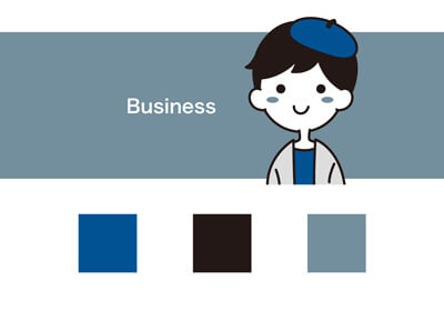
Impression: Cool, Stylish, Sincere, Intellectual
Scene: Company Profile, Business Tools
Isn’t this kind of color used most often in company brochures?
It is a combination that embodies colors that are often seen in business settings, such as the blue of a suit and the gray of a building or computer. As for blue, various shades of blue are used, ranging from slightly brighter blue to dark blue.
While blue has an image of calmness and intelligence, it also has negative images such as “cold” and “ruthless”, so if you use blue too much, it will give a cold impression, so when using it in company information, It should be used in combination with a portrait of a person.
feminine
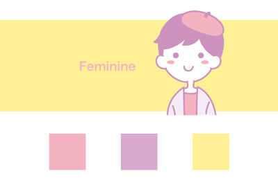
Impression given: kindness, softness, elegance
Scenes: women-dominated company, service pamphlets for women, etc.
Pale warm colors, especially pink, have a warm and soft impression, giving a feminine image.
By combining it with designs such as curves and flowers, you can create a more feminine image.
If you’re a woman, you’ve probably seen a pink poster in the distance, thinking it’s for women, and accidentally checking it out when you approached.
Of course, there are many men in the world who like pink, but if you use pink as the main color, it will inevitably give you a strong impression of being aimed at women, so if you don’t intend to use pink, you need to think about when to use it. there is.
kids
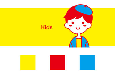
Impression: Energetic, active, curiosity
Scene: Nursery school/kindergarten information, leaflets and pamphlets about toys
Colorful colors express the energy of children.
If you look at children’s toy stores, you may often see these kinds of primary colors with clear colors.
It’s better to narrow down the base to some extent, but when it comes to things for children, the clattering and noisy design is also “child-friendly”.
Eco
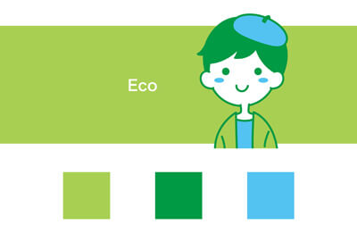
Impression: Nature/Health/Relaxation
Scene: Information on environmental conservation, information on organic matters
The main colors used are the green of the leaves and the blue of the sky and water, which remind us of nature.
In particular, the stronger the ecological connotation, the more often green is used as the main color. It can give you a refreshing and gentle impression. The higher the percentage of green, the stronger the impression of ecology.
Luxury
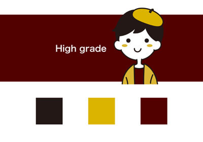
Impression to give: stately and dignified
Scene: information on high-end products and services
Use bold shades. They tend to use as few colors as possible and keep things simple.
Read Also: What Are RGB And CMYK?
inexpensive
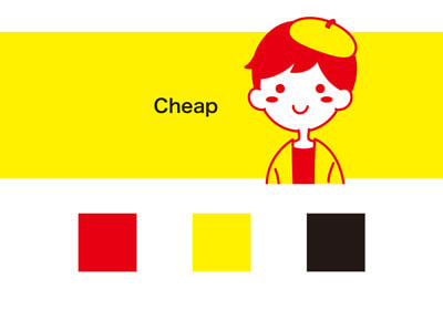
Impression: Cheap/flashy
Scenes: Discount stickers, sale posters, etc.
It is the color of bargain products that you see in supermarkets.
There is some overlap with kid-friendly shades, but the bargains tend to draw attention with intense hues such as red and yellow or navy and yellow.
season – spring
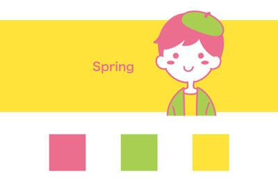
It is a gentle and light color, and yellowish green is often used rather than green, such as the pink of cherry blossoms and the yellow of rape blossoms, for the color of flowers and the image of sprouting.
season – summer
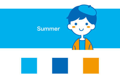
Blue is often used because of the color of blue sky, ice, pools, and the sea.
Since everyone associates it with hot summers, blue is often used for visual information because of its ‘cool image’.
Season – Autumn –
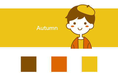
Colors such as smoky colors are used that give a sense of astringency.
If you use blue, you can use navy. If you use green, you can use khaki. As for clothes, storefronts will be filled with colors that are much more subdued than spring and summer.
Read Also: Digging Deep Into The Brand Logo!
season – winter
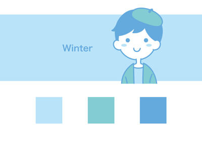
Snow, ice, a slightly dull sky, and a clear image are reminiscent of winter.
However, when used in flyers, etc., warm colors are often preferred over cool colors. Contrary to summer, it’s cold, so your vision will seek a “warm image”.
What did you think?
Regarding colors, a detailed explanation covers a wide range of topics, from the color wheel to tone, so I first introduced the representative shades.
Of course, there are various combinations other than the above, but this time I focused on clarity.
When requesting a design tool, if you choose from a different perspective than “favorite color” or “corporate color”, wouldn’t you be more focused on the delivery side?
